The September incident was humbling. A client’s application slowed to a crawl on a Tuesday afternoon. Our monitoring dashboards showed green across the board — CPU normal, memory normal, no errors in the logs. But users were experiencing fifteen-second page loads.
The problem was a third-party API that had increased its response time from 200 milliseconds to eight seconds. Our health checks did not measure external dependency latency. Our dashboards showed system metrics, not user experience metrics.
We had monitoring. We did not have observability.
Monitoring versus observability
Monitoring tells you when something is wrong. Observability tells you why. Monitoring is a set of predefined checks — is the server up, is CPU below threshold, are error rates normal. Observability is the ability to ask arbitrary questions about your system’s behavior after the fact.
The difference matters when you encounter problems you did not predict — which, in our experience, is most problems worth solving.
The three pillars in practice
Logs answer “what happened.” Structured JSON logs with consistent fields — timestamp, service, request ID, user ID, duration, status — let you reconstruct the sequence of events for any request.
We log at natural boundaries: incoming requests, outgoing API calls, database queries, and error handlers. We do not log inside loops or at every function call. Excessive logging creates noise that makes real signals harder to find.
Metrics answer “how much and how fast.” Request count, error rate, response time percentiles (p50, p95, p99), and queue depth are the metrics that matter for most web applications.
We track four golden signals for every service: latency, traffic, errors, and saturation. If those four are healthy, the service is healthy. If any degrades, we know where to look.
Traces answer “where did the time go.” A distributed trace follows a request from the browser through your edge layer, application server, database, and external APIs. Each step gets a span with a duration.
Traces showed us the September problem immediately — when we finally had them. The application span was 200 milliseconds. The external API span was eight seconds. The bottleneck was obvious.
Alerting without fatigue
Alert fatigue is real and dangerous. When every alert is urgent, none of them are. Teams start ignoring alerts, and real incidents get lost in the noise.
Our alerting rules:
Alert on symptoms, not causes. Alert when error rate exceeds two percent or p95 latency exceeds three seconds — things that affect users. Do not alert on CPU spikes or memory usage unless they cross thresholds that actually cause problems.
Every alert has a runbook. When an alert fires, the notification includes a link to a document explaining what the alert means, what to check first, and how to mitigate. This reduces mean time to resolution and allows any team member to respond, not just the person who set up the alert.
Escalation has a clear path. If an alert is not acknowledged in ten minutes, it escalates. If it is not resolved in thirty minutes, it escalates again. Nobody should be silently failing to respond.
Dashboards that earn their screen space
Most dashboards we inherited were walls of graphs that nobody looked at. We rebuilt them around questions:
- Is the site working? Error rate, latency, and availability for the last hour.
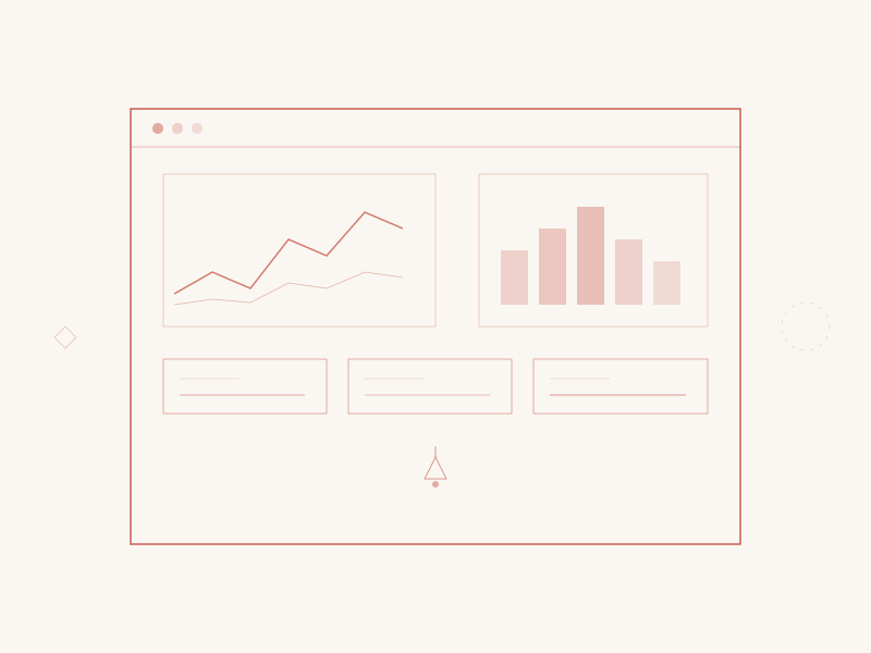
- How are users affected? Core Web Vitals, session error rate, and funnel conversion rate.
- Where are the bottlenecks? Top ten slowest endpoints, slowest database queries, and slowest external dependencies.
Three dashboards. One screen each. Updated in real time. Checked at the start and end of every work day.
The cultural change
The most important shift was not technical. It was cultural. Monitoring is now part of the definition of done. A feature is not shipped until it has structured logging, relevant metrics, and a dashboard panel.
This feels like overhead at first. It pays for itself the first time something breaks and you can diagnose it in five minutes instead of five hours.
After September, we no longer ask “is the server up?” We ask “is the user experience acceptable?” The answers come from different data — and they are far more useful.